### Features
* Themes
* Simple usage
* Zero dependencies
* Multiple color representations
* Color comparison
* Opacity control
* Detail adjustments via. mouse-wheel
* Responsive and auto-positioning
* Supports touch devices
* Swatches for quick-selection
* Fully accessible and i18n
* [Shadow-dom support](#selection-through-a-shadow-dom)
### Themes
|Classic|Monolith|Nano|
|-------|--------|----|
|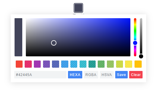|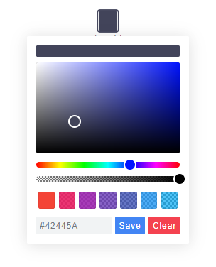||
> Nano uses css-grid thus it won't work in older browsers.
## Getting Started
### Node
Note: The readme is always up-to-date with the latest commit. See [Releases](https://github.com/Simonwep/pickr/releases) for installation instructions regarding to the latest version.
Install via npm:
```shell
$ npm install @simonwep/pickr
```
Install via yarn:
```shell
$ yarn add @simonwep/pickr
```
Include code and style:
```js
// One of the following themes
import '@simonwep/pickr/dist/themes/classic.min.css'; // 'classic' theme
import '@simonwep/pickr/dist/themes/monolith.min.css'; // 'monolith' theme
import '@simonwep/pickr/dist/themes/nano.min.css'; // 'nano' theme
// Modern or es5 bundle (pay attention to the note below!)
import Pickr from '@simonwep/pickr';
import Pickr from '@simonwep/pickr/dist/pickr.es5.min';
```
---
> Attention: The es5-bundle (e.g. legacy version) is quite big (around a triple of the modern bundle).
> Please take into consideration to use the modern version and add polyfills later to your final bundle!
> (Or better: give a hint to users that they should use the latest browsers).
> Browsers such as IE are **not supported** (at least not officially).
### Browser
jsdelivr:
```html
```
Be sure to load the `pickr.min.js` (or the es5 version) **after** `pickr.min.css`. Moreover the `script` tag doesn't work with the `defer` attribute.
## Usage
```javascript
// Simple example, see optional options for more configuration.
const pickr = Pickr.create({
el: '.color-picker',
theme: 'classic', // or 'monolith', or 'nano'
swatches: [
'rgba(244, 67, 54, 1)',
'rgba(233, 30, 99, 0.95)',
'rgba(156, 39, 176, 0.9)',
'rgba(103, 58, 183, 0.85)',
'rgba(63, 81, 181, 0.8)',
'rgba(33, 150, 243, 0.75)',
'rgba(3, 169, 244, 0.7)',
'rgba(0, 188, 212, 0.7)',
'rgba(0, 150, 136, 0.75)',
'rgba(76, 175, 80, 0.8)',
'rgba(139, 195, 74, 0.85)',
'rgba(205, 220, 57, 0.9)',
'rgba(255, 235, 59, 0.95)',
'rgba(255, 193, 7, 1)'
],
components: {
// Main components
preview: true,
opacity: true,
hue: true,
// Input / output Options
interaction: {
hex: true,
rgba: true,
hsla: true,
hsva: true,
cmyk: true,
input: true,
clear: true,
save: true
}
}
});
```
> You can find more examples [here](EXAMPLES.md).
## Events
Since version `0.4.x` Pickr is event-driven. Use the `on(event, cb)` and `off(event, cb)` functions to bind / unbind eventlistener.
| Event | Description | Arguments |
| -------------- | ----------- | --------- |
| `init` | Initialization done - pickr can be used | `PickrInstance` |
| `hide` | Pickr got closed | `PickrInstance` |
| `show` | Pickr got opened | `PickrInstance` |
| `save` | User clicked the save / clear button. Also fired on clear with `null` as color. | `HSVaColorObject or null, PickrInstance` |
| `clear` | User cleared the color. | `PickrInstance` |
| `change` | Color has changed (but not saved). Also fired on `swatchselect` | `HSVaColorObject, PickrInstance` |
| `changestop` | User stopped to change the color | ` PickrInstance` |
| `cancel` | User clicked the cancel button (return to previous color). | `PickrInstance` |
| `swatchselect` | User clicked one of the swatches | `HSVaColorObject, PickrInstance` |
> Example:
```js
pickr.on('init', instance => {
console.log('init', instance);
}).on('hide', instance => {
console.log('hide', instance);
}).on('show', (color, instance) => {
console.log('show', color, instance);
}).on('save', (color, instance) => {
console.log('save', color, instance);
}).on('clear', instance => {
console.log('clear', instance);
}).on('change', (color, instance) => {
console.log('change', color, instance);
}).on('changestop', instance => {
console.log('changestop', instance);
}).on('cancel', instance => {
console.log('cancel', instance);
}).on('swatchselect', (color, instance) => {
console.log('swatchselect', color, instance);
});
```
## Options
```javascript
const pickr = new Pickr({
// Selector or element which will be replaced with the actual color-picker.
// Can be a HTMLElement.
el: '.color-picker',
// Where the pickr-app should be added as child.
container: 'body',
// Which theme you want to use. Can be 'classic', 'monolith' or 'nano'
theme: 'classic',
// Nested scrolling is currently not supported and as this would be really sophisticated to add this
// it's easier to set this to true which will hide pickr if the user scrolls the area behind it.
closeOnScroll: false,
// Custom class which gets added to the pcr-app. Can be used to apply custom styles.
appClass: 'custom-class',
// Don't replace 'el' Element with the pickr-button, instead use 'el' as a button.
// If true, appendToBody will also be automatically true.
useAsButton: false,
// Size of gap between pickr (widget) and the corresponding reference (button) in px
padding: 8,
// If true pickr won't be floating, and instead will append after the in el resolved element.
// It's possible to hide it via .hide() anyway.
inline: false,
// If true, pickr will be repositioned automatically on page scroll or window resize.
// Can be set to false to make custom positioning easier.
autoReposition: true,
// Defines the direction in which the knobs of hue and opacity can be moved.
// 'v' => opacity- and hue-slider can both only moved vertically.
// 'hv' => opacity-slider can be moved horizontally and hue-slider vertically.
// Can be used to apply custom layouts
sliders: 'v',
// Start state. If true 'disabled' will be added to the button's classlist.
disabled: false,
// If true, the user won't be able to adjust any opacity.
// Opacity will be locked at 1 and the opacity slider will be removed.
// The HSVaColor object also doesn't contain an alpha, so the toString() methods just
// print HSV, HSL, RGB, HEX, etc.
lockOpacity: false,
// Precision of output string (only effective if components.interaction.input is true)
outputPrecision: 0,
// Defines change/save behavior:
// - to keep current color in place until Save is pressed, set to `true`,
// - to apply color to button and preview (save) in sync with each change
// (from picker or palette), set to `false`.
comparison: true,
// Default color. If you're using a named color such as red, white ... set
// a value for defaultRepresentation too as there is no button for named-colors.
default: '#42445a',
// Optional color swatches. When null, swatches are disabled.
// Types are all those which can be produced by pickr e.g. hex(a), hsv(a), hsl(a), rgb(a), cmyk, and also CSS color names like 'magenta'.
// Example: swatches: ['#F44336', '#E91E63', '#9C27B0', '#673AB7'],
swatches: null,
// Default color representation of the input/output textbox.
// Valid options are `HEX`, `RGBA`, `HSVA`, `HSLA` and `CMYK`.
defaultRepresentation: 'HEX',
// Option to keep the color picker always visible.
// You can still hide / show it via 'pickr.hide()' and 'pickr.show()'.
// The save button keeps its functionality, so still fires the onSave event when clicked.
showAlways: false,
// Close pickr with a keypress.
// Default is 'Escape'. Can be the event key or code.
// (see: https://developer.mozilla.org/en-US/docs/Web/API/KeyboardEvent/key)
closeWithKey: 'Escape',
// Defines the position of the color-picker.
// Any combinations of top, left, bottom or right with one of these optional modifiers: start, middle, end
// Examples: top-start / right-end
// If clipping occurs, the color picker will automatically choose its position.
// Pickr uses https://github.com/Simonwep/nanopop as positioning-engine.
position: 'bottom-middle',
// Enables the ability to change numbers in an input field with the scroll-wheel.
// To use it set the cursor on a position where a number is and scroll, use ctrl to make steps of five
adjustableNumbers: true,
// Show or hide specific components.
// By default only the palette (and the save button) is visible.
components: {
// Defines if the palette itself should be visible.
// Will be overwritten with true if preview, opacity or hue are true
palette: true,
preview: true, // Display comparison between previous state and new color
opacity: true, // Display opacity slider
hue: true, // Display hue slider
// show or hide components on the bottom interaction bar.
interaction: {
// Buttons, if you disable one but use the format in default: or setColor() - set the representation-type too!
hex: false, // Display 'input/output format as hex' button (hexadecimal representation of the rgba value)
rgba: false, // Display 'input/output format as rgba' button (red green blue and alpha)
hsla: false, // Display 'input/output format as hsla' button (hue saturation lightness and alpha)
hsva: false, // Display 'input/output format as hsva' button (hue saturation value and alpha)
cmyk: false, // Display 'input/output format as cmyk' button (cyan mangenta yellow key )
input: false, // Display input/output textbox which shows the selected color value.
// the format of the input is determined by defaultRepresentation,
// and can be changed by the user with the buttons set by hex, rgba, hsla, etc (above).
cancel: false, // Display Cancel Button, resets the color to the previous state
clear: false, // Display Clear Button; same as cancel, but keeps the window open
save: false, // Display Save Button,
},
},
// Translations, these are the default values.
i18n: {
// Strings visible in the UI
'ui:dialog': 'color picker dialog',
'btn:toggle': 'toggle color picker dialog',
'btn:swatch': 'color swatch',
'btn:last-color': 'use previous color',
'btn:save': 'Save',
'btn:cancel': 'Cancel',
'btn:clear': 'Clear',
// Strings used for aria-labels
'aria:btn:save': 'save and close',
'aria:btn:cancel': 'cancel and close',
'aria:btn:clear': 'clear and close',
'aria:input': 'color input field',
'aria:palette': 'color selection area',
'aria:hue': 'hue selection slider',
'aria:opacity': 'selection slider'
}
});
```
## Selection through a Shadow-DOM
Example setup:
```html
#shadow-root
#shadow-root
```
To select the `.pickr` element you can use the custom `>>` shadow-dom-selector in `el`:
```js
el: '.entry >> .innr .another >> .pickr'
```
Every `ShadowRoot` of the query-result behind a `>>` gets used in the next query selection.
An alternative would be to provide the target-element itself as `el`.
## The HSVaColor object
As default color representation is hsva (`hue`, `saturation`, `value` and `alpha`) used, but you can also convert it to other formats as listed below.
* hsva.toHSVA() _- Converts the object to a hsva array._
* hsva.toHSLA() _- Converts the object to a hsla array._
* hsva.toRGBA() _- Converts the object to a rgba array._
* hsva.toHEXA() _- Converts the object to a hexa-decimal array._
* hsva.toCMYK() _- Converts the object to a cmyk array._
* hsva.clone() _- Clones the color object._
The `toString()` is overridden so you can get a color representation string.
```javascript
hsva.toRGBA(); // Returns [r, g, b, a]
hsva.toRGBA().toString(); // Returns rgba(r, g, b, a) with highest precision
hsva.toRGBA().toString(3); // Returns rgba(r, g, b, a), rounded to the third decimal
```
## Methods
* pickr.setHSVA(h`:Number`,s`:Number`,v`:Number`,a`:Float`, silent`:Boolean`) _- Set an color, returns true if the color has been accepted._
* pickr.setColor(str: `:String | null`, silent`:Boolean`)`:Boolean` _- Parses a string which represents a color (e.g. `#fff`, `rgb(10, 156, 23)`) or name e.g. 'magenta', returns true if the color has been accepted. `null` will clear the color._
If `silent` is true (Default is false), the button won't change the current color.
* pickr.on(event`:String`, cb`:Function`)`:Pickr` _- Appends an event listener to the given corresponding event-name (see section Events)._
* pickr.off(event`:String`, cb`:Function`)`:Pickr` _- Removes an event listener from the given corresponding event-name (see section Events)._
* pickr.show()`:Pickr` _- Shows the color-picker._
* pickr.hide()`:Pickr` _- Hides the color-picker._
* pickr.disable()`:Pickr` _- Disables pickr and adds the `disabled` class to the button._
* pickr.enable()`:Pickr` _- Enables pickr and removes the `disabled` class from the button._
* pickr.isOpen()`:Pickr` _- Returns true if the color picker is currently open._
* pickr.getRoot()`:Object` _- Returns the dom-tree of pickr as tree-structure._
* pickr.getColor()`:HSVaColor` _- Returns the current HSVaColor object._
* pickr.getSelectedColor()`:HSVaColor` _- Returns the currently applied color._
* pickr.destroy() _- Destroys all functionality._
* pickr.destroyAndRemove() _- Destroys all functionality and removes the pickr element including the button._
* pickr.setColorRepresentation(type`:String`)`:Boolean` _- Change the current color-representation. Valid options are `HEX`, `RGBA`, `HSVA`, `HSLA` and `CMYK`, returns false if type was invalid._
* pickr.getColorRepresentation()`:String` _- Returns the currently used color-representation (eg. `HEXA`, `RGBA`...)_
* pickr.applyColor(silent`:Boolean`)`:Pickr` _- Same as pressing the save button. If silent is true the `onSave` event won't be called._
* pickr.addSwatch(color`:String`)`:Boolean` _- Adds a color to the swatch palette. Returns `true` if the color has been successful added to the palette._
* pickr.removeSwatch(index`:Number`)`:Boolean`_- Removes a color from the swatch palette by its index, returns true if successful._
## Static methods
**Pickr**
* create(options`:Object`)`:Pickr` _- Creates a new instance._
**Pickr.utils**
* once(element`:HTMLElement`, event`:String`, fn`:Function`[, options `:Object`]) _- Attach an event handle which will be fired only once_
* on(elements`:HTMLElement(s)`, events`:String(s)`, fn`:Function`[, options `:Object`]) _- Attach an event handler function._
* off(elements`:HTMLElement(s)`, event`:String(s)`, fn`:Function`[, options `:Object`]) _- Remove an event handler._
* createElementFromString(html`:String`)`:HTMLElement` _- Creates an new HTML Element out of this string._
* eventPath(evt`:Event`)`:[HTMLElement]` _- A polyfill for the event-path event propery._
* createFromTemplate(str`:String`) _- See [inline doumentation](https://github.com/Simonwep/pickr/blob/master/src/js/lib/utils.js#L88)._
* resolveElement(val`:String|HTMLElement`) _- Resolves a `HTMLElement`, supports `>>>` as shadow dom selector._
* adjustableInputNumbers(el`:InputElement`, mapper`:Function`) _- Creates the possibility to change the numbers in an inputfield via mouse scrolling.
The mapper function takes three arguments: the matched number, an multiplier and the index of the match._
Use this utils carefully, it's not for sure that they will stay forever!
## Static properties
* version _- The current version._
* I18N_DEFAULTS _- i18n default values._
* DEFAULT_OPTIONS _- Default options (Do not override this property itself, only change properties of it!)._
## FAQ
> How do I initialize multiple pickr's? Can I access the instance via `class` or `id`?
No, you can't. You need to keep track of your instance variables - pickr is (not yet) a web-component.
The best option would be to create new elements via `document.createElement` and directly pass it as `el`.
[example](https://jsfiddle.net/Simonwep/9ghk71c3/).
> I want to use pickr in a form, how can I do that?
You can use `useAsButton: true` and pass a reference (or selector) of your input-element as `el`. Then you can update the input-element whenever a change was made. [example](https://jsfiddle.net/Simonwep/wL1zyqcd/).
> I want to update options after mounting pickr, is that possible?
Unfortunately not. The core-code of this project is rather old (over 2 years), and I made it in my early js-days - the widget is not able to dynamically re-render itself in that way.
You have to destroy and re-initialize it.
## Contributing
If you want to open a issue, create a Pull Request or simply want to know how you can run it on your local machine, please read the [Contributing guide](https://github.com/Simonwep/pickr/blob/master/.github/CONTRIBUTING.md).


